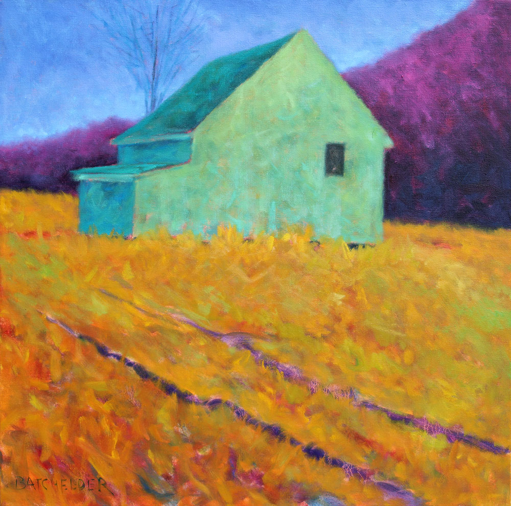
Just completed piece, based on local working farm. As summer comes to an end and fall approaches, local farmers harvest hay for winter feeding. The surrounding trees cast these great abstract shapes, emphasizing the barn’s interior.
On a gray autumn day last October, I was traveling through Vermont, heading North from Cheshire, and came across these two great barns, part of an old sprawling farmstead set on a hill. These two structures sit at the high point of the hill, overlooking the farmhouse and lower meadows. Like many of the weathered, faded barns of the Northeast, these two showed small areas of color, last painted decades ago, reimagined here.
The beautiful Carriage House at Powers Gallery in Acton, MA, showcasing several larger, recent works as part of their annual Holiday Show. For available work, click here.
Several pieces were dropped off at Powers Gallery in Acton Saturday, just ahead of the gallery’s Holiday Show, “A Gift of Art” which opened last night. With Larry Powers, owner, two new pieces “Upland Grove” (right) and “Macintosh” are available, along with others on exhibit. For more information on the show, visit the Powers Gallery website.
 I’m pleased to have several pieces in the upcoming show at the Red Piano Gallery on Hilton Head Island. Included in the show will be this new 36 x 36, “Lavender Field” as well as several smaller pieces, including “Northern Pass” 20 x 20, left.
Having worked with galleries and interior designers on projects where a room either needs a painting to serve as the starting point, or is finished by selecting the right piece to put a finishing touch on the job, it’s always nice to see outcome. And designers’ (either professional or the homeowner themselves) approach to these projects is highly individual, based on personal aesthetic preferences.
This piece, “Cavendish Barn” 48 x 36, was shipped to a residential buyer recently to finish the redesign of the family room in their new house. Interior and architectural design, like art, can either be practiced by following predefined rules, by designing around color theories and design principles, or it can be more free form and interpretive. Nothing wrong with either approach (I lean towards the more free form method), but the success comes through whether or not, when finished, it all works together. And in this room, it does.
Having worked with interior designers, both directly and through galleries, it’s always interesting to see their process for designing an interior space. The starting point could be a piece of furniture, a color theme, a piece of art. Artwork is often either the catalyst for the design project, or the finishing touch.
I was contacted recently by a collector who purchased a piece (“Dusk Light”, 32 x 32) to be part of a room renovation at their residence in Newport, RI. This new piece would join another work acquired previously, both of which were to tie in with the design plan. The images above were sent following the completion of the rooms, and feature architectural elements that tie in not only aesthetically with the work, but regionally.
“Dusk Light” is based on an old barn down the road on the Knight Farm, in Amherst, NH, and the barnboard seen on the walls of the photo on the left is of salvaged wood from a farm not far from here. And the photo on the right, featuring “Summer Color” includes an antique game table made in New Hampshire in the 1700s.
20 x 20 : oil on canvas
On a recent trip to Vermont, traveling along the old roads that seem to go on forever, meandering through hills and valleys, the old farms stand with the familiarity of the last time I’ve taken this route or that, and the only thing that seems to change are the tracks of tractors, carts, trucks, and other equipment used to work the fields and meadows, some fresh, some fading over time.
Years ago, while taking a “literary journalism” course at Boston University, the instructor talked about the book “House” by Tracy Kidder, a writer I admired for how he handled non-fiction storytelling in a way that read like fiction. In the book, Kidder lead readers through the construction of a house…a subject that could have easily resulted in a DIY-sounding how-to guide, like those you find at Home Depot. Instead, it was visual, gripping, and left you wanting to find out more as the story unfolded.
The instructor pointed out that it wasn’t the subject (house building) that made the book great, but how the author composed it…that it was the choices Kidder made during the writing process to leave things out, add other things, and to exaggerate or minimize details.
Whether composing prose or a painting, the distinction between subject matter and decisions made in the composing of the work are what makes it unique. In the sketch above, a scene I’m very familiar with in East Dennis (Cape Cod), was composed to focus on the light, more so than the structure itself. There are elements in the composition that will be taken out (the background tree and driveway), as they (I feel) don’t contribute to the “story.” In creating anything, it’s the editing (the unseen decisions made while composing) that ultimately turn the subject into art.
The blocked in painting of the earlier post titled “Recurring Theme” showed the early stages of “Sage,” based on an often painted barn not far from home. Here, “Sage” is complete, and captures neither literal color of the structure, or the mood at any given time, but is instead an imagined palette applied to a real place I know well.