This piece evolved from a barn I came across in rural Massachusetts that had years of overgrowth growing up and around it. Initially the focus was to be on this overgrowth, with the green of the foliage that brushed up against the barn exterior casting a greenish tint to what had once been white paint. But early on, the focus changed, and the foliage was edited out, and the emphasis became the color created by sun shining through, and reflecting off the vegetation that had begun to consume the structure.
Rural structures are full of history. Coming across an old barn, farmhouse, or beach cottage, you see it as it is now, either modernized, or dilapidated, surrounded by more modern stuff, or overgrown from disuse. Whatever the condition, there is an underlying beauty to their simplicity, and in how they fit in with their landscape. This piece, “Westerly Shade” (48 x 36), is down the road from the studio, near the top of Walnut Hill, one of the many hills in town, encountered as you climb the road that cuts up and over it.
As beautiful as the grayish monochromatic snowy landscape is outside, it’s always a bit better (in my opinion), once color slowly starts to emerge in the Spring, and then fully explodes in the Fall. My annual winter impatience usually kicks in around now, so the recently completed “Blue Ridge” is perhaps a bit of color therapy to head off the winter blues.
Just returned from delivering a commissioned piece, “Lower Meadow” 42 x 30, to buyer through Powers Gallery. Several months in the making, this piece was a bit of a challenge, but a LOT of fun, starting with use of the four-wheeler this fall to get around the property’s fields and meadows to get initial on-site sketches.
As with most commissions, the challenge is to create the piece the way you (I) normally do, but to incorporate those elements the buyer indicates are key to the composition. In this piece, the uphill view of the barn from the lower meadow was the preferred perspective, and the piece needed to indicate a suggestion of the huge oak that has occupied its place on the farm for a hundred years, but without becoming the focal point.
Recently completed piece, based on an old farm in a rural town west of Boston. The time of day created these huge shadows, made longer by the downward slope of the back meadow. Looking up, the barn, beyond these shadows, and the dramatic backdrop of the treeline, created a situation where the original subject of the piece became secondary to everything else.
It’s great to explore a newfound scene, viewing it from every angle, making quick sketches to capture the place. This small canvas, “Low Meadow” 12 x 12, was done to execute an idea sketched out in pastel, and potentially to become a larger canvas.
On a recent early morning walk along one of the Sound-side beaches of Cape Cod, a bank of clouds forming further up Cape, maybe over Buzzards Bay, sat on the horizon as a dark strip of grayish purple. But as the morning progressed, and the breezes pickup up, the sky darkened as the cloud bank expanded northward over Falmouth and Hyannis towards Yarmouth and Dennis.
That unique combination soft early morning light and shadow, with a backdrop of storm-cloud-darkened skies, is especially dramatic on the Cape, with its sea-level landscape and cottages hidden within dunes and seagrass. This pastel study, “Nearing Storm” was done in preparation for a larger oil on canvas.
 I was recently introduced to a great non profit in Acton, MA, Household Goods whose mission is to provide free furniture and home furnishings to men, women, and families in need. For these individuals looking to rebuild their lives following any number of setbacks, this organization provides a critical bridge to their starting over.
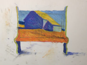
I was honored to be asked to give a second chance to one of their pieces of donated furniture, as part of their upcoming Artful Goods auction to be held at Powers Gallery October 21 in Acton, Ma.
The piece I am donating in support for this organization, “West of Boston” (oil on bench), will be auctioned off along with many other artist-contributed pieces of repurposed furniture.
The latest addition to the collection of limited edition prints, “Dune Light” is now available through the studio, and can be ordered as a print on paper (unframed), framed (in simple black 1-inch wood frame), or as a gallery wrap canvas. To inquire about framed or gallery wrap canvas prints, please contact the studio here:
More information on “Dune Light” and all available prints on paper can be found here.
There’s a strip of Bay-side beach on Cape Cod that has been a special part of my life since I was a kid. Extending West to East from Chapin to Cold Storage, this sand-bar expanse of beaches are interspersed along their shores with dunes that have, over the years, shifted and reshaped themselves according to the will of tides and wind. In some of these dunes (for better or worse), homes have been built, some many years ago, others more recently. This piece, “Dune Light” (48 x 30) is of one such home, looming over the beach we most often go to in summer. I’ve looked up at this scene many times, deciding this summer to finally paint it.